
SHAURYA CEMENT
SHAURYA CEMENT
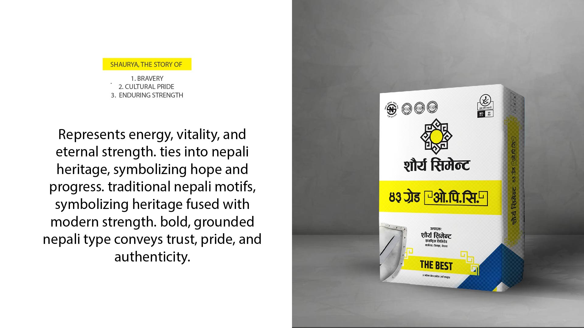
(Strength Rooted in Tradition)
The Shaurya Cement branding project was inspired by the concept of “Strength with Heritage.” The goal was to develop a visual identity that reflects durability and trust while honouring Nepal’s cultural roots.
Branding of Shaury Cement
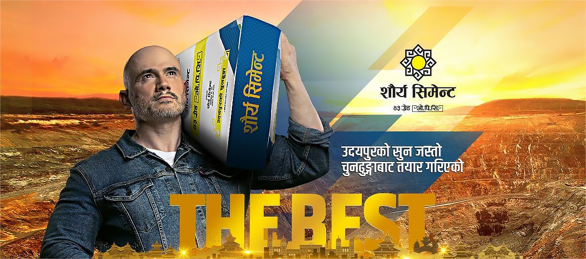
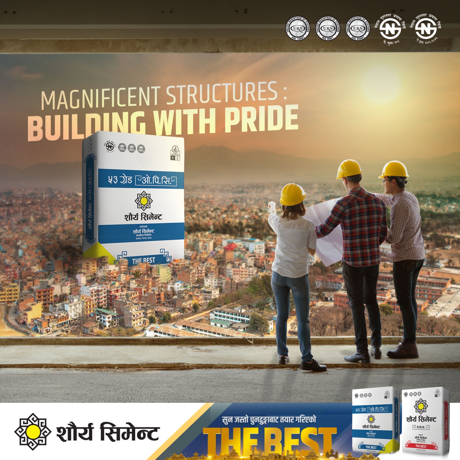
“THE BEST”
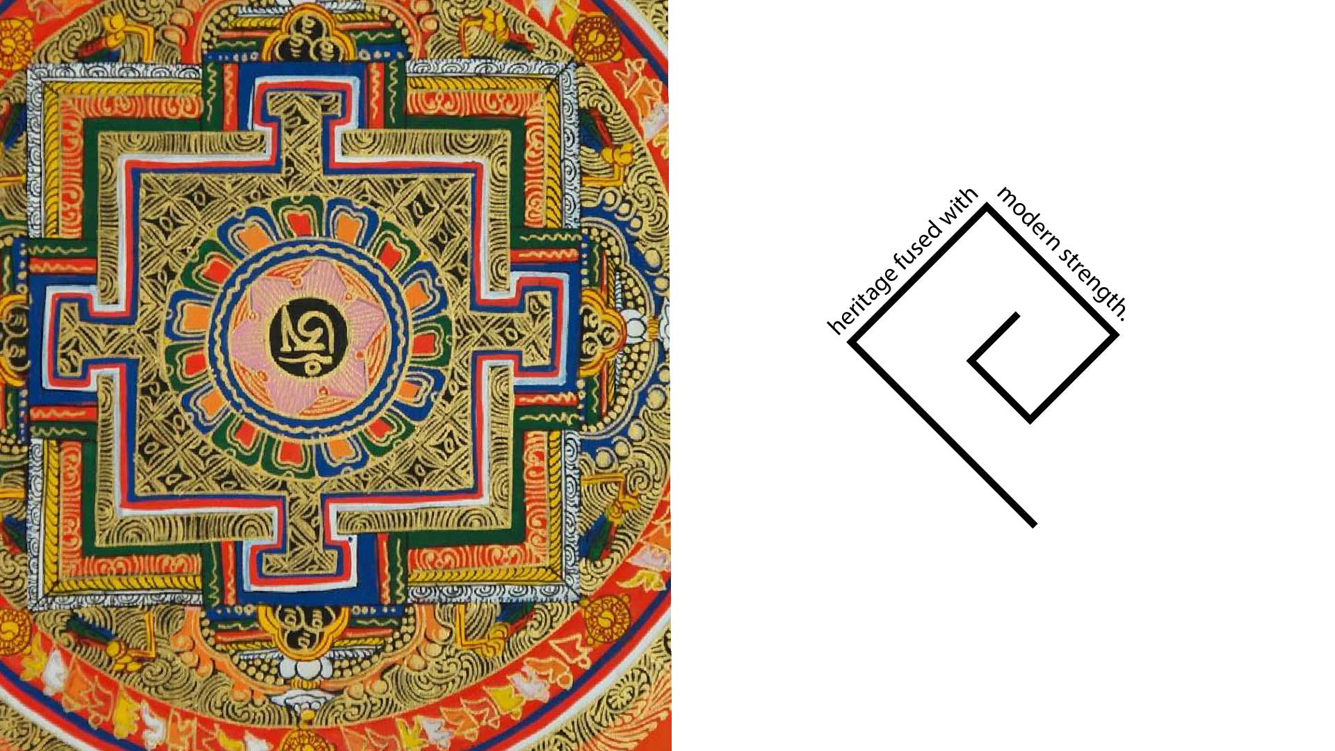
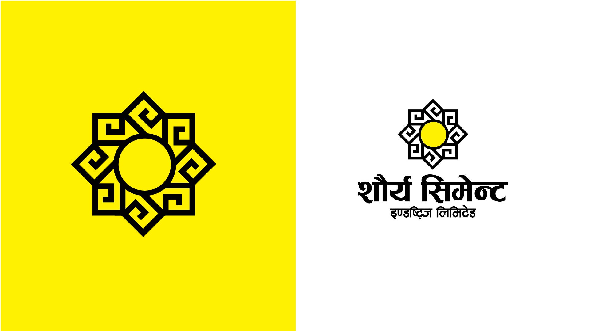
The logo design draws inspiration from traditional Nepali motifs; geometric patterns symbolising balance, endurance, and unity; fused with a modern minimalistic approach to appeal to today’s construction and industrial market. The sun at the centre signifies energy and resilience, while the symmetrical pattern radiating outward represents structural integrity and precision; qualities that mirror the brand’s promise of strength and reliability. The bold yellow and black colour palette evokes confidence, optimism, and power, creating a striking visual contrast that stands out across both print and digital platforms. Typography in Nepali script was chosen intentionally to reinforce authenticity and local pride, positioning Shaurya Cement as a homegrown brand built for progress. From logo creation to brand applications, the design aimed to embody both cultural symbolism and corporate professionalism, ensuring the identity connects emotionally with consumers while maintaining a strong industrial presence.
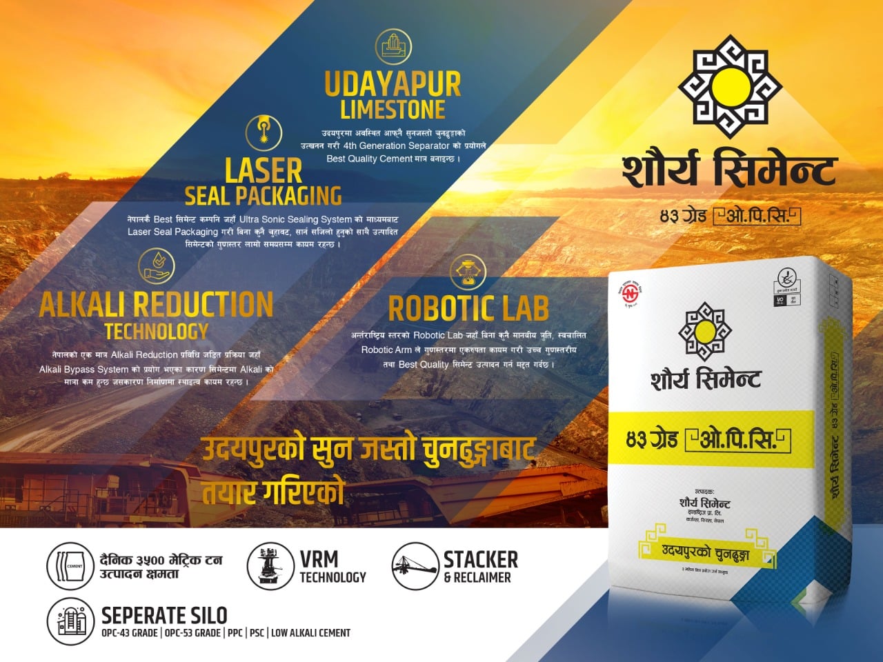
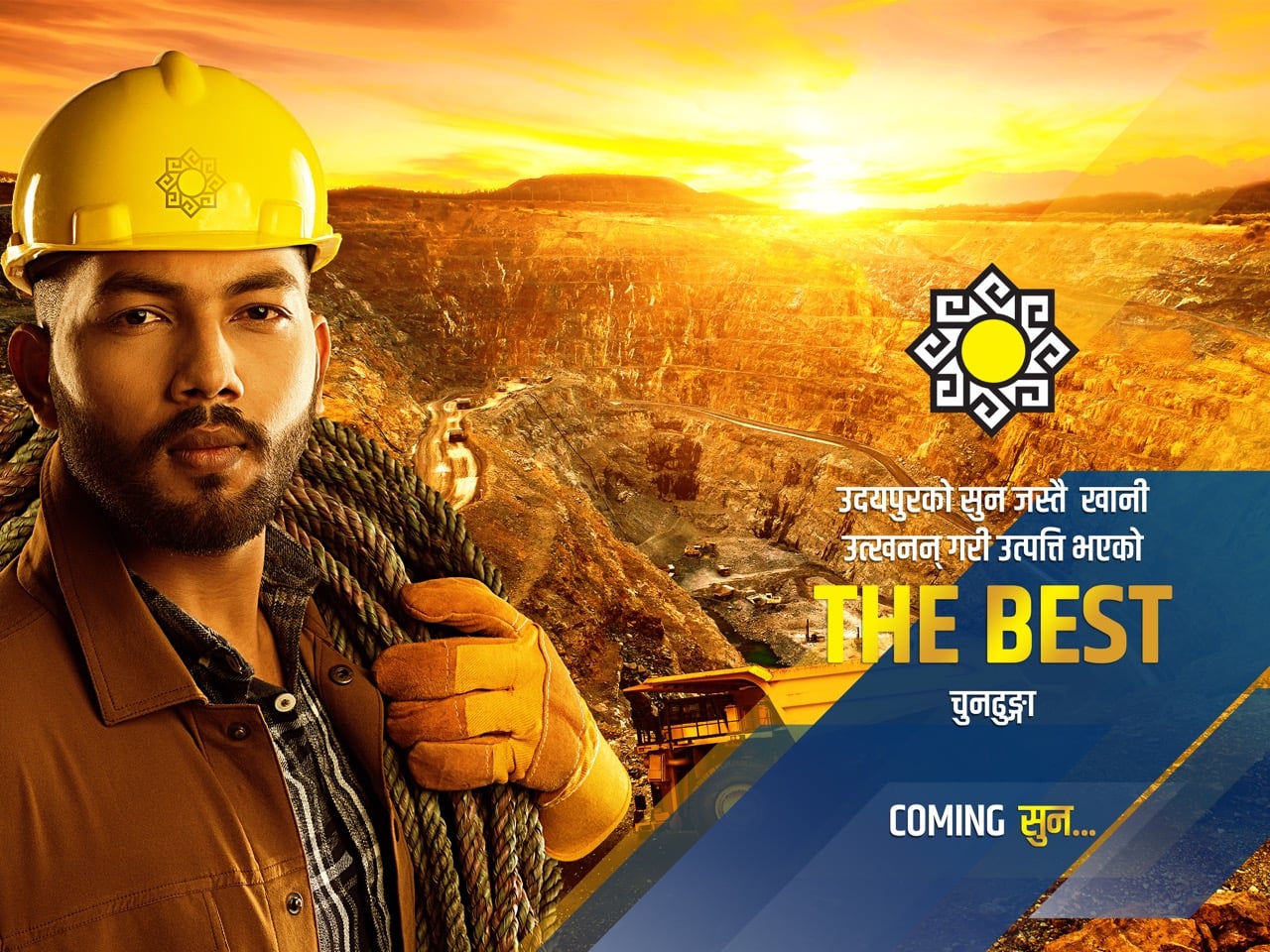
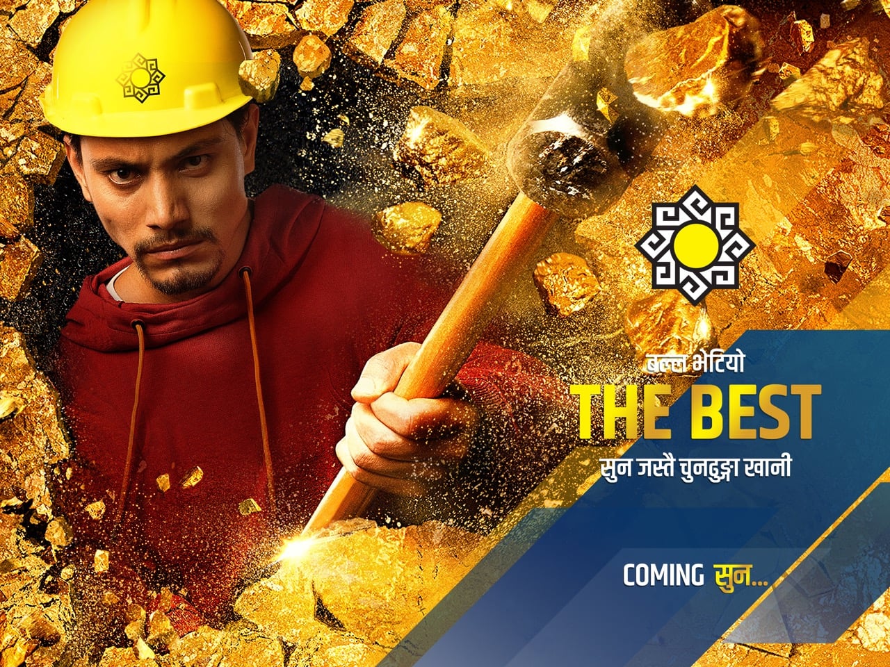
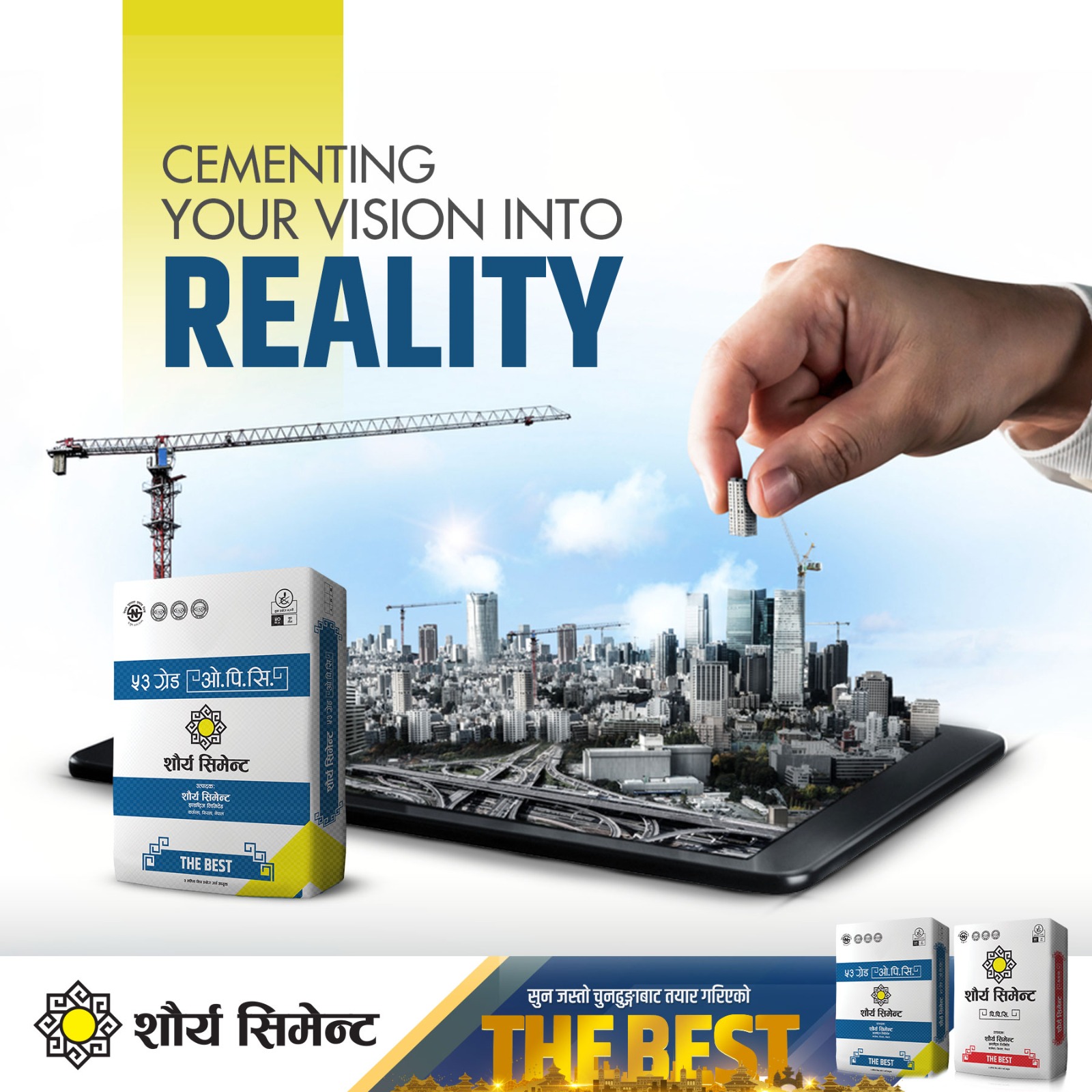
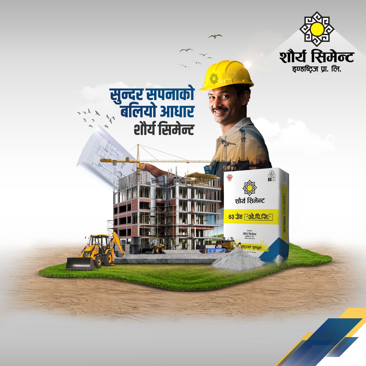
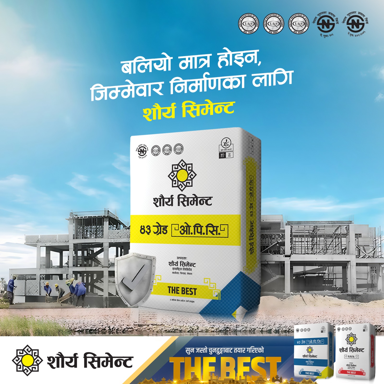
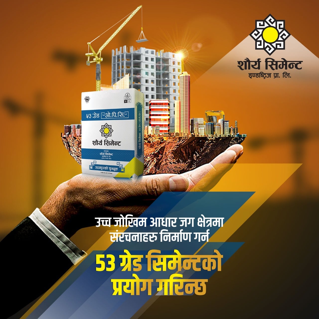
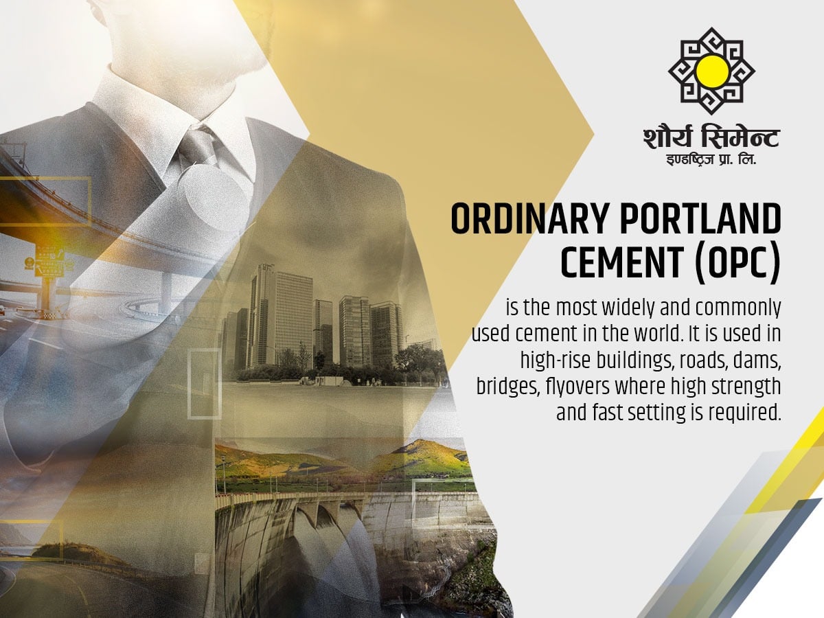
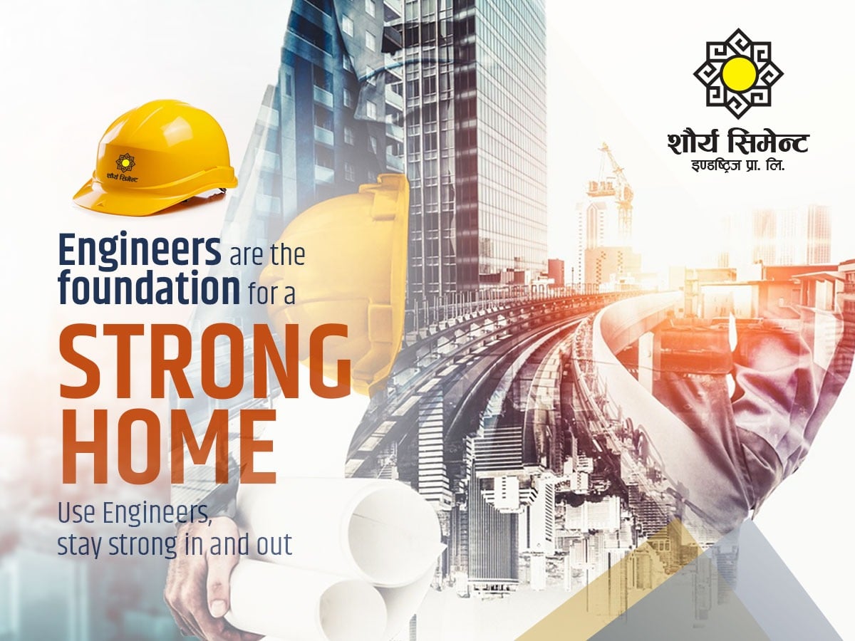
Digital Ads

This project demonstrates my ability to integrate cultural elements with contemporary branding principles; balancing aesthetic appeal with strategic brand storytelling.